UX design
Lakeshore Learning
As a Senior UX Designer I supported both B2B and B2C customers, wearing many hats, from front-end development of UI components to UX design and illustration. I was part of a world-class team that both maintained and replatformed Lakeshore's eCommerce site.
The replatform
During my time at Lakeshore we carried out a full eCommerce migration from Blue Martini to Oracle Commerce, moving the front end from PHP to Knockout.js. I was part of the core UX team throughout, working closely with our back-end engineers to design new product funnels, refactor legacy code, and mentor colleagues in Knockout.js and Oracle systems.
-
Search results page
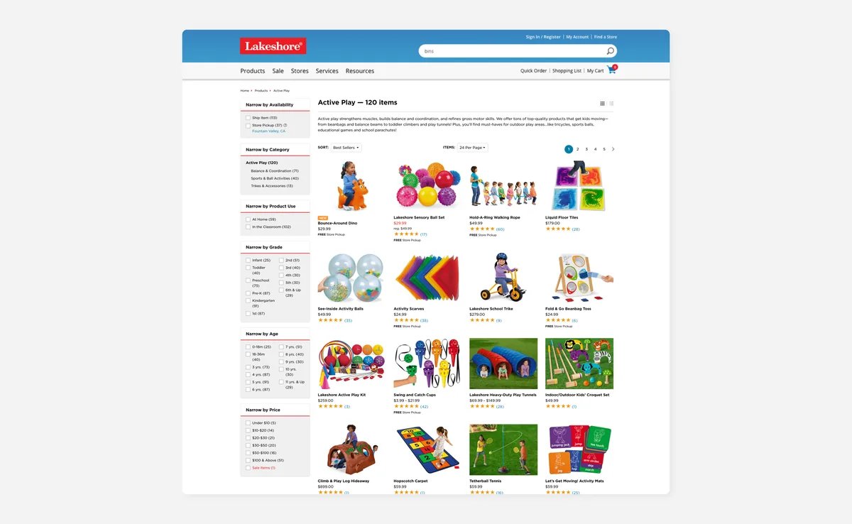
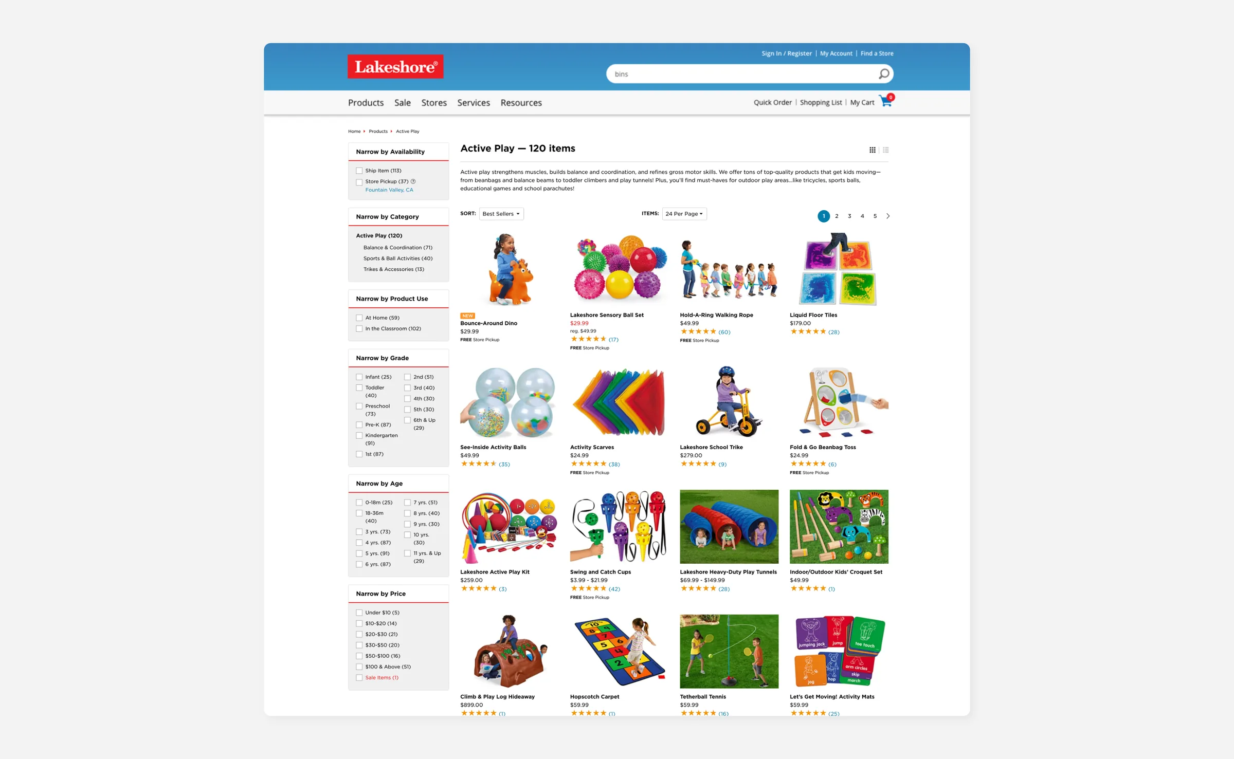
I designed and built the search results and product listing pages using Oracle's Endeca faceted search, making a catalogue of thousands of products actually navigable. Components had to be responsive and work all the way back to IE7, while staying light enough to deliver fast, consistent results.
-
Product detail page
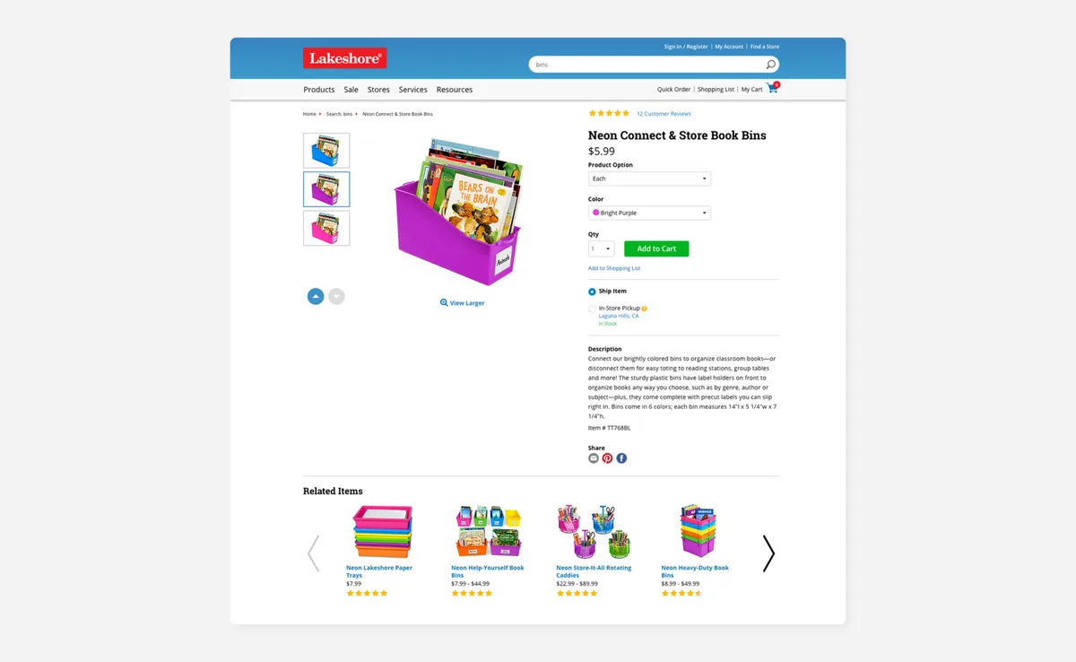
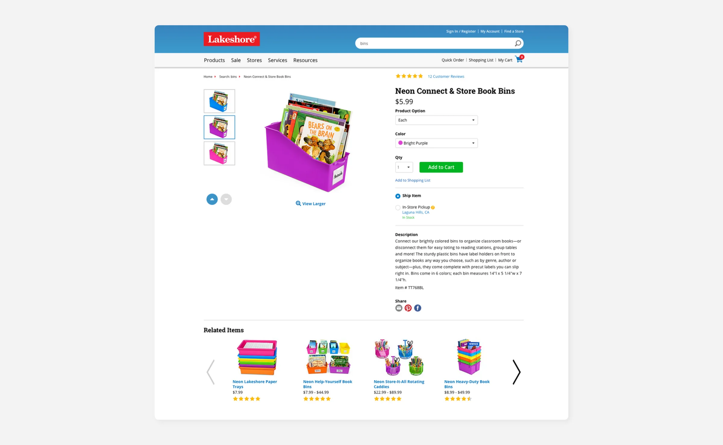
The product page looks simple, but it's one of the most technically complex pages on the site, with critical dependencies across front-end and back-end systems. I was responsible for the horizontal and vertical carousels, multi-select dropdowns, and an overhauled customer reviews feed.
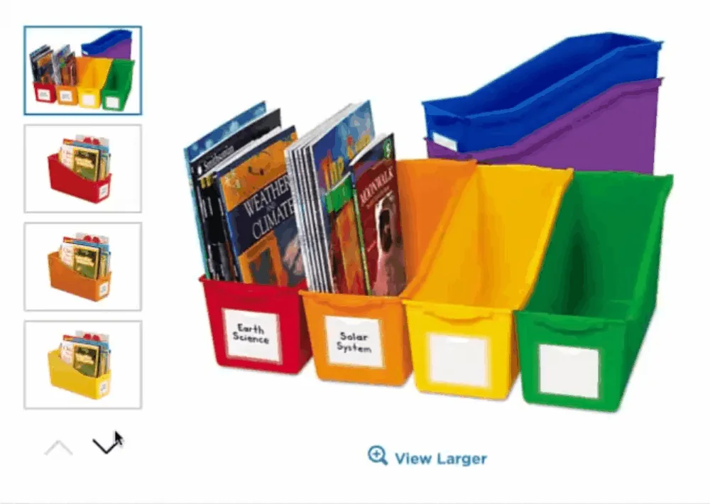
Component 1Vertical carouselThe product image carousel had to scale responsively, pull images from our CDN at the best resolution, and work all the way back to IE7. 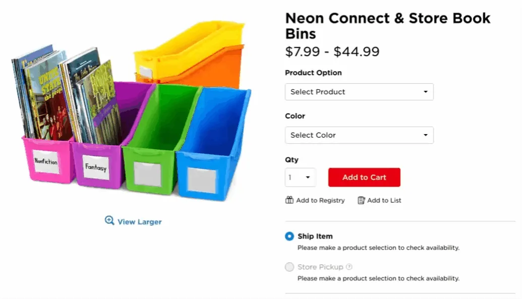
Component 2Multi-select dropdownA dynamic dropdown that works with the vertical carousel, updating the main product image when you choose an option. 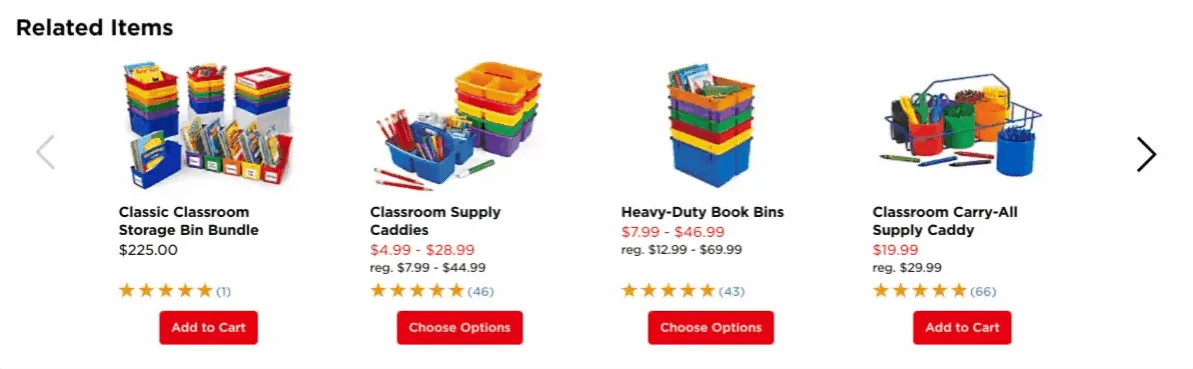
Component 3Horizontal carouselRebuilt from scratch for every screen size. On phones, an uneven number of images deliberately shows part of the next one as a cue to scroll. -
Checkout funnel
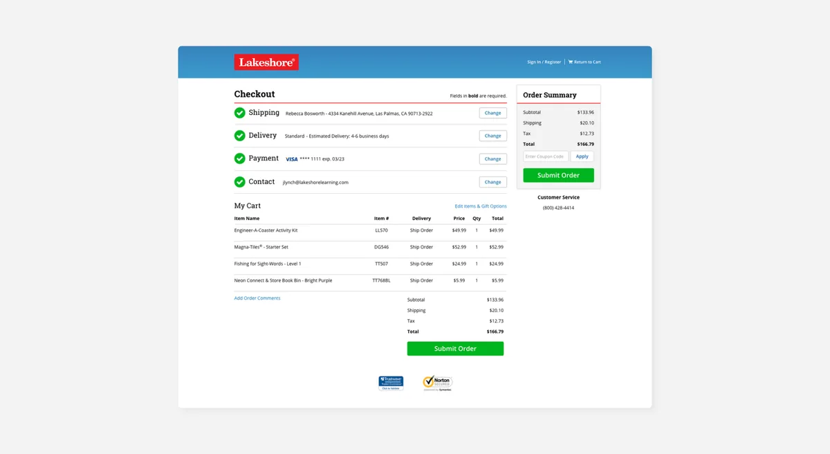
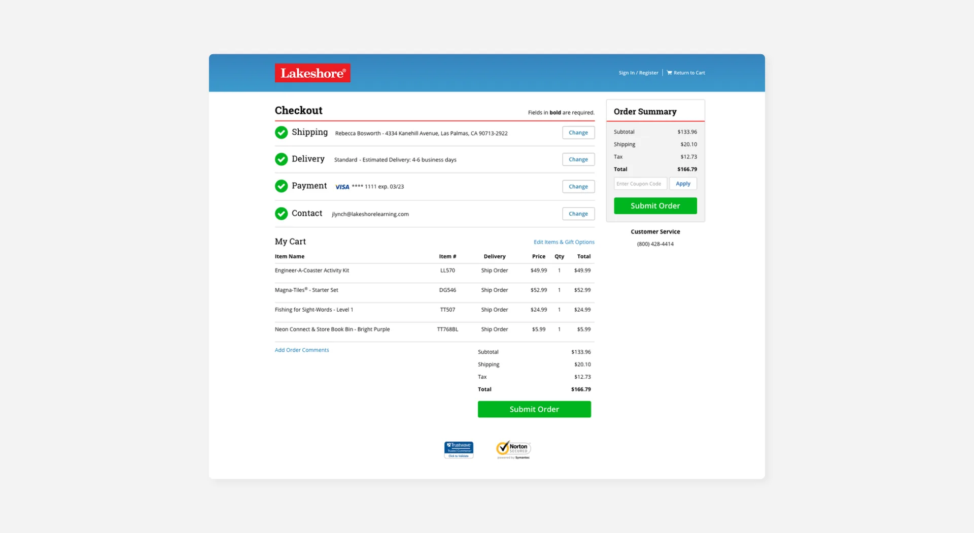
A full redesign of the checkout funnel, reducing friction at every step and adding ship-to-store and save-for-later. This work contributed to a 25% increase in checkout conversion after launch.
-
A/B testing
We brought in Adobe Test & Target early in the process, running A/B tests on key features with the wider eCommerce team and building a culture of data-driven iteration to qualify design decisions.
Challenges and successes
-
Challenge 1
Scaling up to Oracle's CMS during a big migration, while learning new technologies on the job.
The migration meant mastering Oracle's CMS tools and Knockout.js at the same time. Some areas of the site could be ported directly; others needed complete overhauls, especially anything touching Adobe CDNs, product imagery, and the slider system. Some of my favourite memories from this project are the pair-programming sessions, sketching ideas over a pint, and the particular joy of figuring out why a piece of code worked when it definitely shouldn't have.
-
Challenge 2
Making assets as high-impact as possible through A/B testing and close watch of conversion rates.
We brought in Adobe Test & Target early, working with the wider eCommerce team to design tests, analyse results, and make data-informed decisions. A/B testing gave us room to experiment and pivot based on real user behaviour, and led to more impactful design choices and measurably better conversion.
-
Challenge 3
Maintaining an existing eCommerce platform while building a new one.
This took strong communication and a team culture of saying yes to each other: clearing blockers fast and sharing the load. Working together, we built a camaraderie that led to the successful delivery of a high-impact, world-class replatform. Behind every great product is a great team, and our collaborative spirit was the foundation of what we achieved.
Outcomes
The replatform wasn't just a technical migration. It moved the needle on every metric that mattered. Here's what the work delivered.
The passion Chris brought to all of his work was truly inspiring to myself and the other members of our team. Christopher puts all of himself into his work and his results reflect that.
-
30%
Sales increase in year one
The first full year after launch saw a 30% uplift in sales, a direct result of a faster, cleaner, easier-to-navigate shop. Better search, a smoother checkout, and a more confident product page all played their part.
-
$1B+
A billion-dollar company
Within a few years of the replatform, Lakeshore crossed the billion-dollar revenue milestone.
-
25%
Increase in checkout conversion
A full checkout redesign drove a 25% improvement in conversion rate, confirmed through A/B testing.
-
96%
Positive customer feedback
Customer satisfaction held strong throughout, with 96% positive feedback at scale.
Also in this case study
Bonus material
A few extras from the five years: feature work, team life, and the things that don't fit neatly into a replatform story.
Feature pages
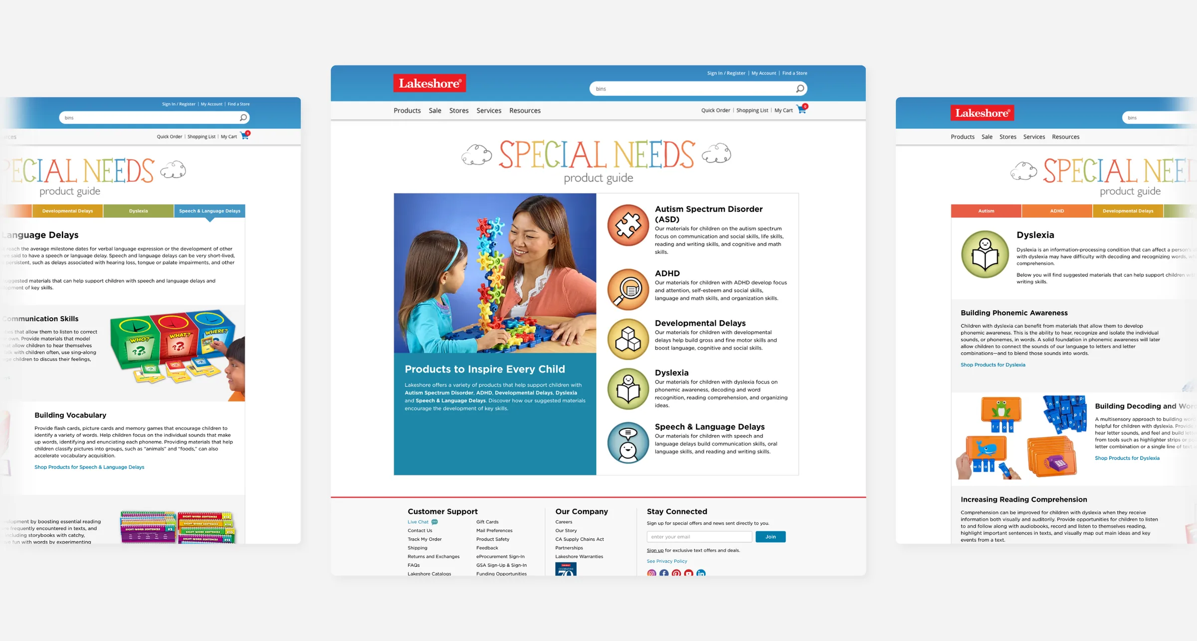
Alongside the replatform, the sprint schedule included standalone experiences supporting Lakeshore's commitment to teachers and parents. One project I led was the Special Needs Product Guide, a product funnel that helps parents and carers find the right tools for their child. I was responsible for the UX, responsive page layouts, icons, typography, and banners.





Life at Lakeshore
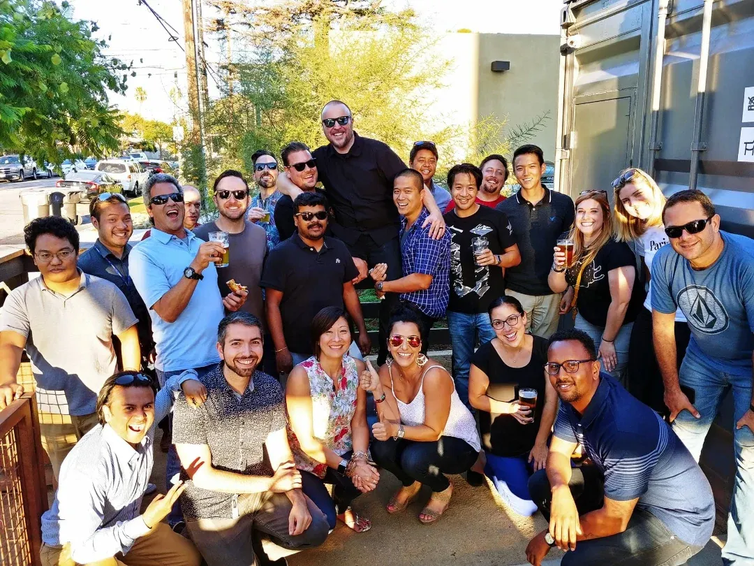
Lakeshore always prioritised inclusion. Whether I was socialising with colleagues or in a meeting with our CEO, I felt heard and valued. I formed lasting friendships and loved working with both the eCommerce team and the wider company. When I left to return to the UK, friends from Lakeshore and my previous role came together to see me off. I feel incredibly fortunate to have met so many wonderful people, and I've grown through every connection I've made.